It happens a lot now. You ask ChatGPT or Gemini for a logo, it gives you something that looks okay to you, you drop the PNG on your website and move on. Then a printer, a sign shop or a merch supplier asks for the vector file, and things get complicated.
Because an AI generated image and a properly built logo are two very different things.
What AI actually gave you
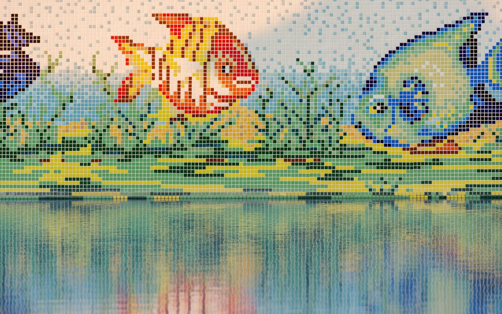
An image. A grid of pixels, usually a PNG or JPEG with limitations. It looks sharp at the size it was made, and falls apart when you blow it up or try to edit a single shape.
A vector is built differently, from points, paths and curves. It scales to a billboard with zero blur, and you can change any shape or color cleanly.
Spotting AI slop in a logo
“AI slop” is the slang for low effort AI output that looks impressive for a second and falls apart when you look closer. In logos it usually shows up as:
- Decoration with no job. Swooshes, stars, dots and leaves that make it look “designed” but don’t mean anything.
- Wonky geometry. Curves that almost match, joins that don’t quite meet, uneven line weights, symmetry that’s slightly off.
- Fake lettering. Letters that look right from a distance but share no real construction, with odd spacing and proportions.
Zoom in to 400 percent. That’s where most of it shows up.
Can Illustrator vectorize it?
Sometimes. Adobe Illustrator has Image Trace, which converts a raster image into editable vector artwork. Place the image, run Image Trace, tweak the settings, expand. Done.
The catch: auto tracing copies the image, flaws and all. You usually get hundreds of unnecessary anchor points, lumpy curves and shapes that are a pain to edit. Technically it’s a vector. It’s just not a good one.
The proper way: rebuild it
When a client brings me an AI concept, I treat it as a reference, not a file. The process looks like this:
- Figure out what’s actually worth keeping in the concept
- Strip out the decoration that isn’t doing anything
- Rebuild the geometry with clean shapes and as few points as possible
- Fix the curves, symmetry and negative space
- Replace or redraw the lettering properly
- Test it tiny (favicon size) and huge
- Build the variations you’ll need
AI might get you 40 percent of the way to an interesting idea. The other 60 percent is where most of the thinking lives. Maybe the icon is too heavy. Maybe it looks great at 500 pixels and turns to mush at 24. Those calls need a person.
What files you should end up with
For a properly built logo, you’d normally want source files (AI, EPS or PDF), an SVG for the web, and PNG and JPG exports. Plus variations: the full logo, horizontal and stacked versions, the icon on its own, and black, white and one color versions. The exact package depends on the project. The point is that it works everywhere you need it.
Can I legally use an AI logo?
That’s a separate question. Check the current terms of the AI tool you used, country laws, and search for existing trademarks before you build a business on it. Being able to generate an image doesn’t automatically give you a strong mark you can own. I’m a designer, not a lawyer, so for anything serious, ask one.
So should you use AI for logos?
My take: if you use it at all, keep it at the exploring stage. It can help you test a direction or show a designer what’s in your head. Just don’t mistake the generated picture for the finished identity.
AI gives you a picture of an idea. A designer turns it into something structured, editable and built to last.