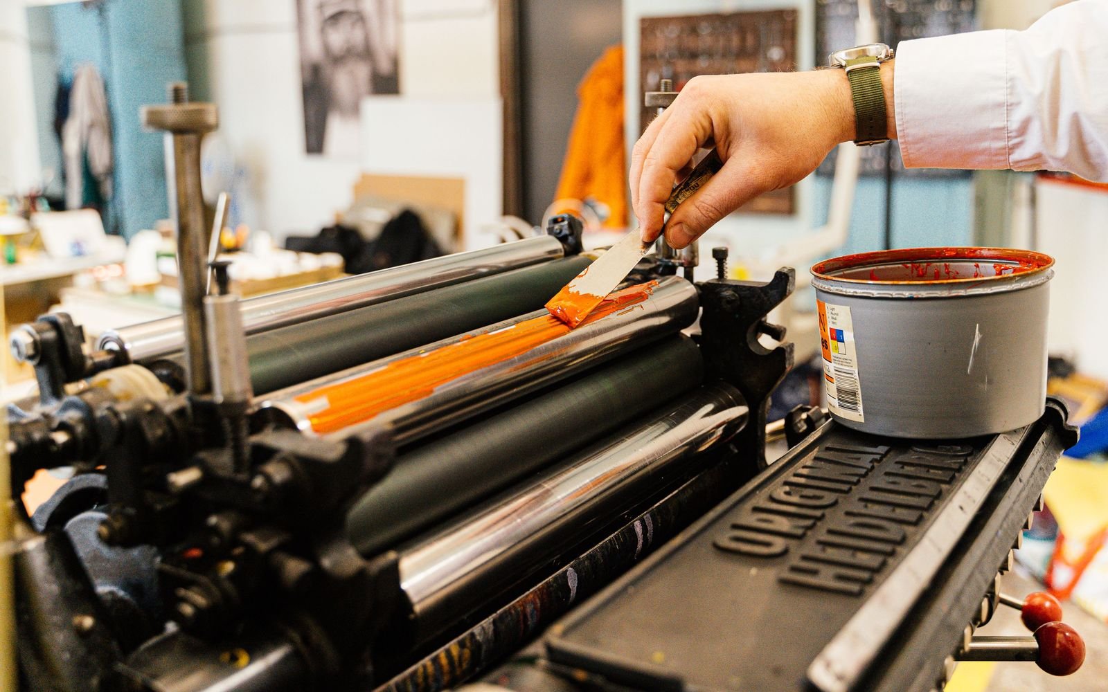
Print is unforgiving. On a website you can fix a typo in ten seconds. Once 2,000 business cards are printed, that typo lives in your wallet for the next three years. A few basics prevent most of the problems.
RGB vs CMYK
Screens create color with light: red, green and blue (RGB). Printers use ink: cyan, magenta, yellow and black (CMYK). Ink can’t reproduce as many colors as a screen, so some bright colors come out duller on paper. That electric blue on your monitor might not exist in CMYK at all.
What that means in practice:
- Set up print files in CMYK, or check the conversion before you send them
- Your brand should have defined CMYK values, not just a HEX code
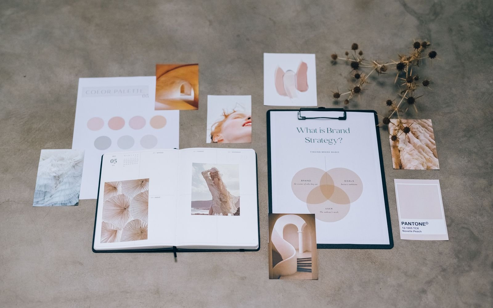
- For colors that really matter, use a Pantone spot color, especially on packaging and signage
- For a deep black, printers often use a “rich black” mix instead of plain black ink. Ask which mix they prefer
What makes a file print ready
- Bleed: extend backgrounds and images past the trim line, usually 3 mm or 0.125 inches on every side, so no white edges show after cutting
- Safe margin: keep text and logos at least 3 to 5 mm inside the trim
- Resolution: photos at 300 ppi at the printed size
- Fonts: embedded in the PDF or converted to outlines
- Format: a high resolution PDF, often PDF/X-1a or PDF/X-4, whichever your printer asks for
When in doubt, ask the printer for their specs before you design, not after. They all have slightly different requirements.
Proof it properly
Always check a digital proof, and for bigger runs, a physical one. Paper changes everything. The same design looks different on glossy, matte and uncoated stock, and colors on uncoated paper usually come out softer.
Which collateral is worth making?
Brand collateral is anything printed that carries your brand. Business cards, letterheads, envelopes, flyers, brochures, packaging, stickers, signage, menus.
You don’t need all of it. Start with what you’ll actually use in the next six months. A café needs menus, cup sleeves, stickers and signage. A consultant needs business cards, a proposal template and maybe a one page brochure. Make those well, and add the rest when there’s a real use for it.
Keep it consistent
This is where brand guidelines earn their keep. Every piece should use the same logo files, colors and type rules, so a flyer from one printer and a sign from another still look like the same brand. If you’re not sure what yours should include, here’s what a brand identity package should contain.